Lollipop
Run the tool first...
棒棒糖图是一种因形似棒棒糖而得名的数据可视化图表。它融合了散点图和条形图的特征,通常由一线段和一圆圈构成。线段的长度以及圆圈的大小或位置可用于表示值的大小。
输入文件
-
ONTOLOGY:GO 类别(BP、CC、MF)
-
Term:GO 名称
-
Count:每个 GO 上的富集次数

输出文件

图表内容说明
- X轴:GO条目名称(Term),每个点代表一个GO功能条目。
- Y轴:每个GO条目中富集到的基因数目(Count)。
- 颜色:不同的GO分类(ONTOLOGY),如BP(生物过程)、CC(细胞组分)、MF(分子功能),用不同颜色区分。
- 棒棒糖结构:每个GO条目用一根“棒棒糖”表示,底部为线段,顶端为圆点,圆点内标注该GO条目的基因数。
- 图例:右侧显示各GO分类的颜色对应关系。
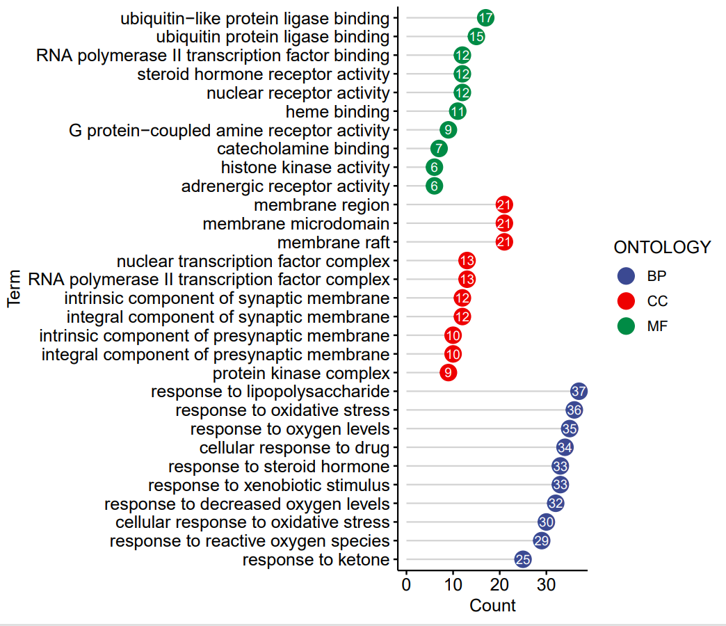
The Lollipop Chart is a data visualization chart named for its resemblance to a lollipop. It combines the characteristics of a scatter plot and a bar chart, typically consisting of a line segment and a circle. The length of the line segment and the size or position of the circle can be used to represent the magnitude of the value.
Input
-
ONTOLOGY: GO category (BP, CC, MF)
-
Term: GO name
-
Count: The number of enrichments on each GO
Output
Chart Description
X-axis: GO term names (Term), where each dot represents a specific GO functional term.
Y-axis: The number of enriched genes (Count) within each GO term.
Color: Different GO categories (ONTOLOGY) are distinguished by color, such as BP (Biological Process), CC (Cellular Component), and MF (Molecular Function).
Lollipop structure: Each GO term is represented by a "lollipop" – a line segment (stem) with a dot at the top. The dot displays the gene count for that GO term.
Legend: The color-coded GO categories are displayed in the legend on the right.