ROC
Run the tool first...
ROC 曲线(接收者操作特征曲线)是一种用于评估分类模型性能的图形化表示方法。它通过描绘真正例率(TPR)与假正例率(FPR)之间的关系来展示模型的分类能力。在 ROC 曲线中,横轴表示假正例率,纵轴表示真正例率。
输入文件
\t)分隔。第一列为 ID,第二列为 type。
输出文件

图表内容说明
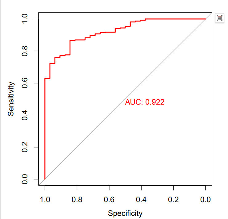
- 图形类型:ROC曲线(受试者工作特征曲线)
- X轴:假阳性率(1-Specificity)
- Y轴:真阳性率(Sensitivity)
- 红色曲线:表示所选变量对分类结果的判别能力。
- AUC值:图中会显示AUC(Area Under Curve,曲线下面积)数值。AUC越接近1,说明该变量的判别能力越强;AUC为0.5时,说明判别能力与随机猜测无异。
The ROC curve (Receiver Operating Characteristic curve) is a tool for evaluating the performance of classification models. It displays the classification ability of the model by plotting the relationship between the True Positive Rate (TPR) and the False Positive Rate (FPR). The horizontal axis of the ROC curve represents the False Positive Rate, while the vertical axis represents the True Positive Rate.
Input
Output
Chart Description
Chart Type: ROC curve (Receiver Operating Characteristic curve)
X-axis: False Positive Rate (1 - Specificity)
Y-axis: True Positive Rate (Sensitivity)
Red Curve: Represents the classification performance of the selected variable.
AUC Value: The chart displays the AUC (Area Under Curve) value.
-
An AUC closer to 1 indicates stronger discriminative ability.
-
An AUC of 0.5 suggests discriminative ability equivalent to random guessing.