Scatter Plot of Gene-Gene Correlation
Run the tool first...
相关性散点图是一种用于展示两个变量之间关系的图表类型。
输入文件
![]()
文件的第一行是 ID,第二行和第三行是基因,各行列之间以制表符(\t)分隔。
输出文件

- 中心散点图:
- 图中的每一个点代表一个样本。
- 点的分布趋势揭示了两个基因表达量的关系。如果点倾向于从左下到右上分布,则为正相关;反之则为负相关。
- 图中的统计值 "R" 代表斯皮尔曼(Spearman)相关系数,衡量相关性强度;"p" 代表p-value,用于判断该相关性是否显著(通常 p < 0.05 认为显著)。
- 顶部和右侧的密度图:
- 顶部图(橙色): 显示了横坐标基因在所有样本中表达量的分布情况。峰值越高,表示该表达水平的样本越集中。
- 右侧图(蓝色): 显示了纵坐标基因在所有样本中表达量的分布情况。
A correlation scatter plot is a type of chart used to display the relationship between two variables.
Input
![]()
The first row is ID, the second and third rows are genes, separated by \t.
Output
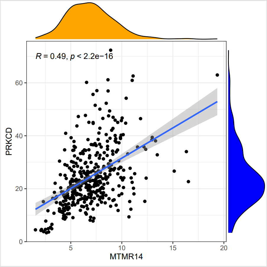
1. Chart Purpose
This chart aims to visualize and analyze whether there is a statistically significant association between the expression levels of two genes (the x-axis represents [Gene 1 name] and the y-axis represents [Gene 2 name]) across all samples.
2. How to Interpret This Chart
Central Scatter Plot:
-
Each point in the plot represents a sample.
-
The distribution trend of the points reveals the relationship between the expression levels of the two genes:
-
If the points tend to cluster from the bottom-left to the top-right, it indicates a positive correlation.
-
If the points trend from the top-left to the bottom-right, it suggests a negative correlation.
-
-
The statistical values provided are:
-
"R": Represents the Spearman correlation coefficient, measuring the strength of the correlation.
-
"p": Represents the p-value, used to determine whether the correlation is statistically significant (typically, p < 0.05 is considered significant).
-
Top and Right Density Plots:
-
Top plot (orange): Displays the distribution of the x-axis gene's expression levels across all samples. A higher peak indicates that more samples are concentrated at that expression level.
-
Right plot (blue): Shows the distribution of the y-axis gene's expression levels across all samples.