Genome
Run the tool first...
基因组可视化是一种用于展示基因组数据的图形化表示方法,能够帮助研究人员和科学家更直观地理解基因组的结构、功能和变异。
输入文件应包含以下列:
- 第1列:染色体名称(如chr1, chr2, chrX, chrY等)
- 第2列:起始位置(基因组坐标)
- 第3列:结束位置(基因组坐标)
- 第4列:数值(如表达量、突变频率等)

输出文件

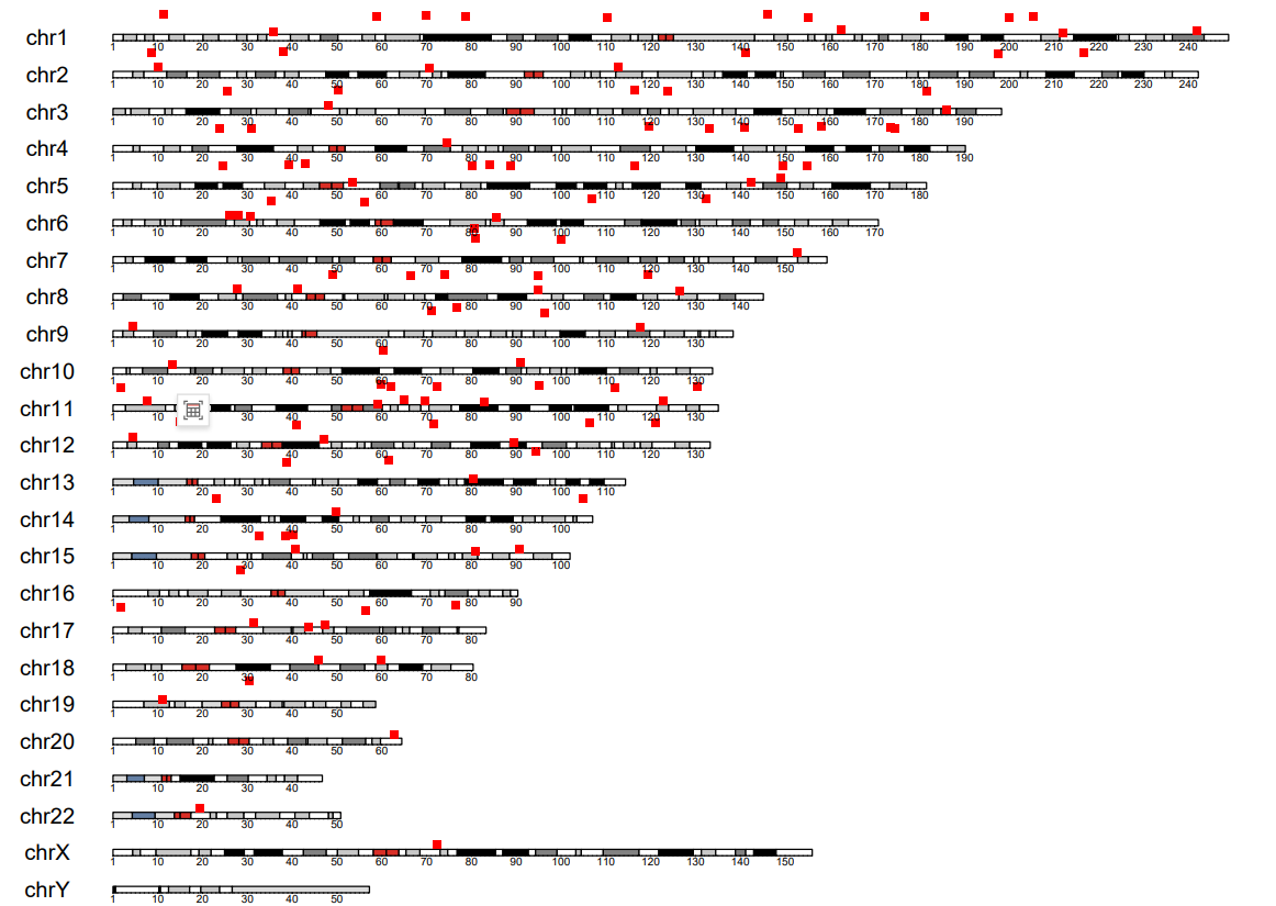
图表内容说明
- 图形类型:人类全基因组数据分布图(基于hg38基因组版本)
- X轴:基因组坐标(以碱基对为单位,主刻度间隔10Mb,次刻度间隔1Mb)
- Y轴:数据值(如基因表达量、突变频率、拷贝数变异等)
- 染色体:显示人类所有24条染色体(22对常染色体+X+Y染色体)
- 数据点:红色点状标记表示每个数据点在基因组上的位置和对应的数值
- 坐标范围:Y轴范围自动设置为数据的第10百分位数到第90百分位数的2倍,避免极端值影响可视化效果
Genome Visualization is a graphical representation method used to display genomic data, which can help researchers and scientists more intuitively understand the structure, function, and variation of the genome.
The input file should contain the following columns:
Column 1: Chromosome name (e.g., chr1, chr2, chrX, chrY, etc.)
Column 2: Start position (genomic coordinate)
Column 3: End position (genomic coordinate)
Column 4: Numerical value (e.g., expression level, mutation frequency, etc.)
Output
Chart Description
Chart Type: Human Whole-Genome Data Distribution Plot (Based on hg38 Genome Assembly)
X-axis: Genomic Coordinates (in base pairs; major ticks at 10Mb intervals, minor ticks at 1Mb intervals)
Y-axis: Data Values (e.g., gene expression levels, mutation frequency, copy number variation, etc.)
Chromosomes: Displays all 24 human chromosomes (22 autosomes + X + Y chromosomes)
Data Points: Red dot markers indicate the genomic position and corresponding value of each data point.
Scale:
-
Y-axis range is automatically set from the 10th percentile to 2× the 90th percentile of the data to minimize the impact of outliers on visualization.