ggalluvial
Run the tool first...
\t)分隔。

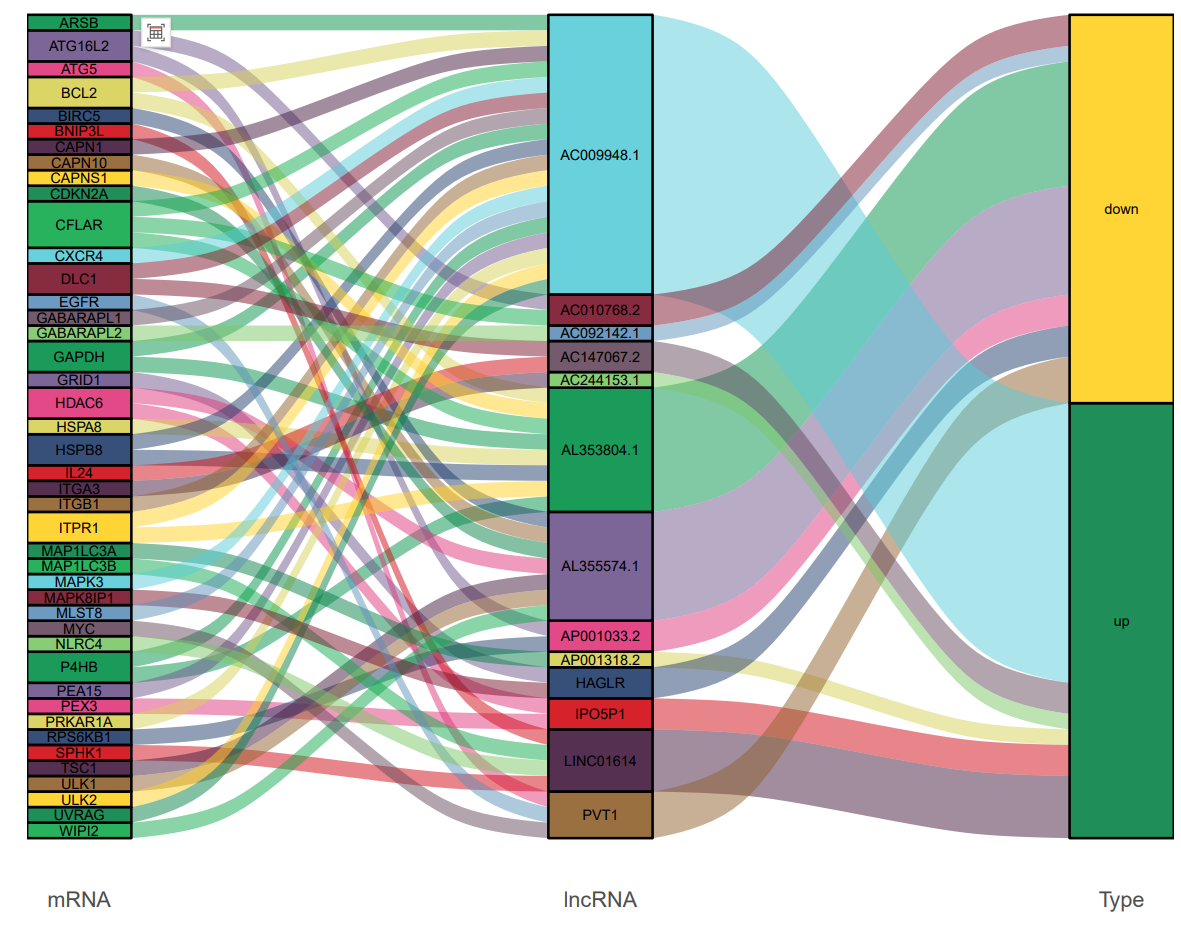
- 纵向轴 (Axes): 每一列代表一个独立的分类变量(例如:样本分组、物种丰度、功能通路等)。
- 彩色块 (Strata): 轴上的每个彩色矩形块代表该变量下的一个具体类别。块的高度与归属于该类别的样本数量成正比。
- 流带 (Alluvia): 连接不同轴上彩色块的流带,其厚度代表了在不同维度下保持相同属性的样本数量。通过追踪流带,我们可以观察到样本从一个类别到另一个类别的具体走向和数量变化。
-
Chart Purpose
This visualization illustrates the distribution, flow, and relationships of sample data across multiple categorical dimensions. It clearly reveals how a population is segmented according to different criteria (represented by the vertical axes) and demonstrates the correspondence between these segmentations. -
How to Interpret This Chart
-
Vertical Axes: Each column represents an independent categorical variable (e.g., sample groups, species abundance, functional pathways, etc.).
-
Colored Strata: The colored rectangular blocks on each axis represent specific categories within that variable. The height of each block is proportional to the number of samples belonging to that category.
-
Alluvial Flows: The flowing bands connecting colored blocks across different axes represent samples that maintain consistent attributes across dimensions. The thickness of each flow band indicates the quantity of samples transitioning between categories. By tracing these flows, one can observe the directional movement and quantitative changes of samples from one category to another.