radar
Run the tool first...
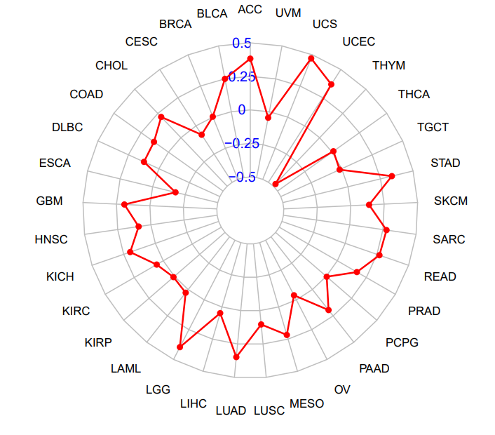
雷达图(Radar Chart),又称为蜘蛛网图或星形图,可在单一图表中展示多维数据(变量)。每个维度对应一个轴,所有轴均匀分布,便于对多个相关指标进行全面比较与分析。
输入文件

文件包含两列,第一列是 id,第二列是相关系数,列之间以制表符分隔。
输出文件

- 轴 (Axes): 每一个从中心点放射出的轴线,代表一个独立的评估指标。
- 形状 (Shape): 图中的红色多边形轮廓线连接了该样本在所有指标上的具体数值点。
- 轮廓线越向某个轴的外侧凸出,代表该样本在此项指标上的数值越高。
- 轮廓线越靠近中心或向内凹陷,代表其在该指标上的数值越低。
- 刻度 (Scale): 从中心向外扩展的同心网格线是数值刻度,用于衡量每个指标数值的大小。
The Radar Chart, also known as a spider web chart or star chart, can display data from multiple dimensions (variables) in a single chart. Each dimension has an axis, and all axes are evenly distributed, which facilitates the comprehensive comparison and analysis of multiple related indicators.
Input
The file consists of two columns, the first column is the id, and the second column is the correlation coefficient, separated by a tab character.
Output
1. Chart Purpose
This radar chart aims to visually display the comprehensive performance or scores of samples across multiple different dimensions.
2. How to Interpret This Chart
-
Axes: Each radial axis extending from the center represents an independent evaluation metric.
-
Shape: The red polygonal outline connects the sample's specific data points across all metrics.
-
The more the outline bulges outward along a particular axis, the higher the sample's score is for that metric.
-
The closer the outline is to the center or indented inward, the lower its score is for that metric.
-
-
Scale: The concentric grid lines radiating outward from the center serve as numerical scales, used to measure the magnitude of each metric's value.