Survival Discrete Plot
Run the tool first...
离散变量生存曲线是一种用于分析和展示生存数据的图形工具,特别适用于生存时间作为离散变量的情况。生存数据通常包含两个关键信息:生存时间和事件是否发生(如死亡、疾病复发等)。离散变量生存曲线可以帮助研究人员直观地比较不同组别生存时间的分布,从而分析可能影响生存时间的因素。
输入文件
输入文件的第一列是 ID,第二列是 futime,第三列是 fustat,第四列是 Stage,各列之间以制表符(\t)分隔。

输出文件

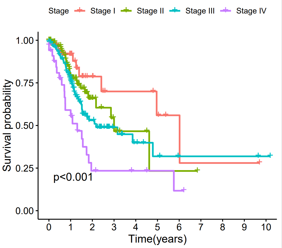
- 坐标轴: 横坐标代表从研究开始算起的时间,纵坐标代表相应时间点的累计生存概率。
- 曲线: 每条不同颜色的曲线代表一个特定的患者分组。曲线的位置越高,说明该组的生存率越高。
- 曲线下降: 曲线的每一次阶梯状下降,表示该组内有患者发生了终点事件(如死亡)。
- P值: 右上角的P值是Log-rank检验的结果,用于评估所有分组的生存曲线之间是否存在统计学上的显著差异。通常,P值小于0.05被认为是显著差异。
Discrete variable survival curves are graphical tools used for analyzing and displaying survival data, particularly suitable for situations where survival time is a discrete variable. Survival data typically includes two key pieces of information: survival time and whether an event has occurred (such as death, disease recurrence, etc.). Discrete variable survival curves can help researchers intuitively compare the distribution of survival times across different groups, thereby analyzing which factors may affect survival time.
Input
The input file has the first column as ID, the second column as futime, the third column as fustat, and the fourth column as Stage, separated by \t.
Output
Survival Analysis Plot (Kaplan-Meier Curve) Description
Chart Purpose
This figure uses the Kaplan-Meier method to compare the differences in time-dependent survival probabilities among different patient groups categorized by a grouping variable.
How to Interpret This Chart
-
Axes:
-
X-axis: Represents time since the start of the study (e.g., months or years).
-
Y-axis: Represents the cumulative survival probability at the corresponding time point.
-
-
Curves:
-
Each colored curve represents a specific patient group.
-
A higher curve position indicates a better survival rate for that group.
-
Stepwise drops in the curve indicate that an endpoint event (e.g., death) occurred in that group.
-
-
P-value:
-
The P-value (displayed in the top-right corner) is derived from the Log-rank test, which evaluates whether there is a statistically significant difference in survival curves among all groups.
-
A P-value < 0.05 is typically considered statistically significant, suggesting that survival differences between groups are unlikely due to random chance.
-