TimeROC
Run the tool first...
生存 ROC 曲线是一种用于评估生存预测模型性能的工具,尤其适用于涉及时间因素的生存数据。与传统 ROC 曲线不同,生存 ROC 曲线考虑了时间因素,从而可以评估模型在不同时间点的预测性能。
输入
\t)分隔。第一列为 ID,第二列为 futime,第三列为 fustat,第四列为 score。
输出文件

图表内容说明
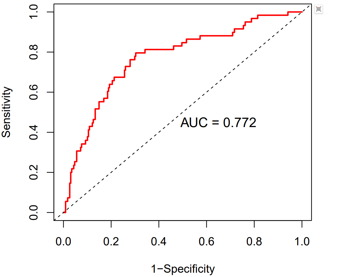
- 图形类型:时间依赖性ROC曲线(Time-dependent ROC Curve)
- X轴:假阳性率(1-Specificity)
- Y轴:真阳性率(Sensitivity)
- 红色曲线:表示所选变量(如 score)在指定时间点(如1年)对生存结局的预测能力。
- AUC值:图中显示AUC(Area Under Curve,曲线下面积)数值。AUC越接近1,说明该变量在该时间点的预测能力越强;AUC为0.5时,说明预测能力与随机猜测无异。
结果解读建议
- 该图用于评估连续变量(如风险评分、基因表达等)在特定时间点(如1年)对生存结局的预测效果。
- 曲线越靠近左上角,AUC值越大,说明预测效果越好。
- 适用于生存分析、预后模型评估等场景。
Purpose:
The survival ROC curve is a tool for evaluating the performance of survival prediction models, particularly for time-to-event data. Unlike traditional ROC curves, survival ROC curves incorporate time-dependent factors, allowing assessment of predictive performance at different time points.
Input File Format:
The input file contains four tab-delimited columns (\t):
-
ID: Sample/patient identifier
-
futime: Follow-up time (time-to-event or censoring)
-
fustat: Event status (typically 0=censored, 1=event occurred)
-
score: Predicted risk score/probability from the model
Ootput File Format:
Chart Description
Chart Type: Time-dependent ROC Curve
X-axis: False Positive Rate (1 - Specificity)
Y-axis: True Positive Rate (Sensitivity)
Red Curve: Represents the predictive performance of the selected variable (e.g., score) for survival outcomes at a specified time point (e.g., 1 year).
AUC Value: The chart displays the AUC (Area Under Curve) value.
-
An AUC closer to 1 indicates stronger predictive ability at that time point.
-
An AUC of 0.5 suggests predictive performance equivalent to random guessing.
Interpretation Guidance:
-
This plot evaluates the predictive efficacy of continuous variables (e.g., risk scores, gene expression) for survival outcomes at specific time points (e.g., 1 year).
-
A curve closer to the top-left corner and a higher AUC value indicate better predictive performance.
-
Applicable to survival analysis and prognostic model validation scenarios.